Oleeo is updating its user interface (UI) and user experieces (UX) because, not only do we want to deliver functionality that helps you recruit the right talent, but we want the experience of doing it to be efficient, streamlined and intuitive.
We’re taking a phased approach to these updates, both to allow our dev teams to respond to feedback, and so users aren’t confronted with a whole system that looks different overnight. Last year we rolled out our improvements to the left hand menu and search - now, we’re focusing on vacancies.
Our UX team have worked with users to uncover and understand the challenges they face when working with vacancies.
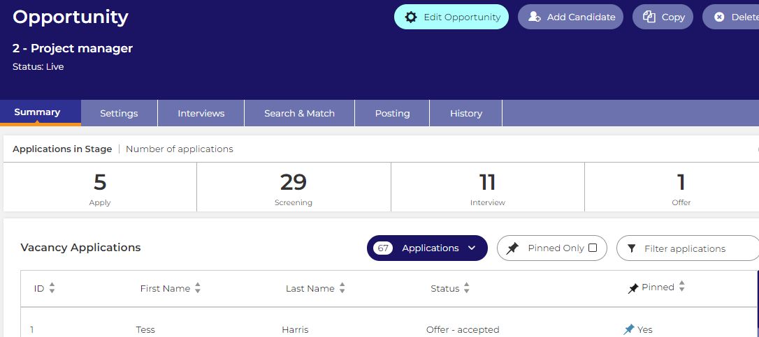
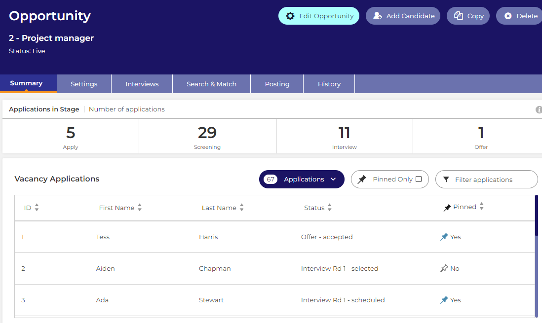
From this, we designed a new vacancy dashboard focused around core areas of improvement, including:
- Straightforward vacancy creation
- Simplified navigation through condensed tabs
- A single point of editing
- Dashboard widgets - displaying applications and status relevant information
As we approach the go live date, we’ll be working with customers directly to let them know when they can expect the update to appear in their system, and guiding them through the transition.
Learn more about the new interface
- Read our user guide for detailed look at the new condensed tabs.
- Tips on getting started with the new look
- How to use the application list
For simplicity, we’ve used the term vacancy here to refer to what might be called opportunity or requisition in your system. The update will conform to whatever term your system uses.


