


WHAT IS THE TIP?
💡 Great, you’re on the new Vacancy Management Interface with a brand new dashboard page, but now what? How can you leverage that dashboard to make it really powerful? We have some great thoughts lined up below for you to consider!
N.B: Many organisations use different terminologies: Vacancy/Opportunity/Campaign/Competition. In this article we will be referring to them as vacancies.
Save the Widget Scroll - Fix Your Rows
💡 Fix the row height on your dashboards to prevent your widgets from having individual scroll bars when viewed on a smaller screen.
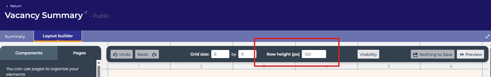
By setting the row height, your users can then scroll through the ‘fixed’ dashboard itself instead of individual widgets - overall making everything much clearer for laptop or small screen users.
Your builder will default to have an automatic row height as below:

To fix the row height, overwrite the ‘auto’ with a figure - this will prevent your individual widgets from self adjusting and maintain the row height and the entire dashboard page will scroll instead.
🔧 Use case: Do you have users who work on laptop screens or smaller screens? Do you have several widgets on each dashboard page?
Expand Your Page
💡 Make use of your screen’s real estate by using the two arrows in the right corner to expand your screen, making your dashboard clearer and again reducing cognitive load.
🔧 Use Case: Do you have users who work on laptop screens or smaller screens? Do you have widgets on your dashboard that you would like to see more clearly without having to scroll as far?
Critical Information Presented at Every Stage to the Right Users
💡 Build a different dashboard for each vacancy status and then also by role profile - be selective about what you show to whom to make it more powerful, meaningful and reduce cognitive load.
Ask yourselves - what do you really need to see at each stage of the vacancy process? What would be truly useful to you and your users?
🔧 Use Case: Do you have low touch users who rarely log in who would benefit from clear instructions at each stage? Or users who purely log in with a specific task in mind and don’t need to see the same thing as everyone else?
🔧 Examples: Here are some good examples of the sort of things you could do at each stage!
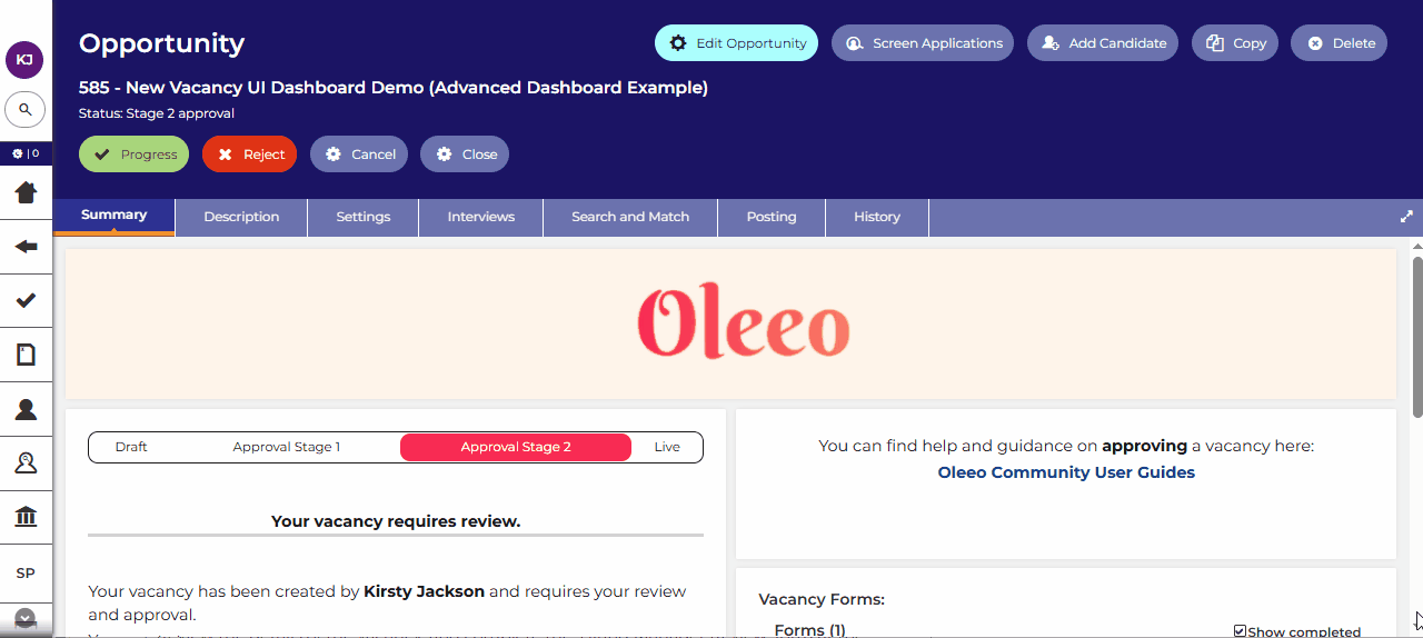
💡 Status = Draft:
- Simple instructions for your users - so they know exactly what is expected of them
- Details of the vacancy that they are raising
- Links to additional guidance
- Access to all the forms that need to be completed (Applicable to Multi-form Vacancies Only)
- Comments for recording vacancy specific notes for other users and future reference
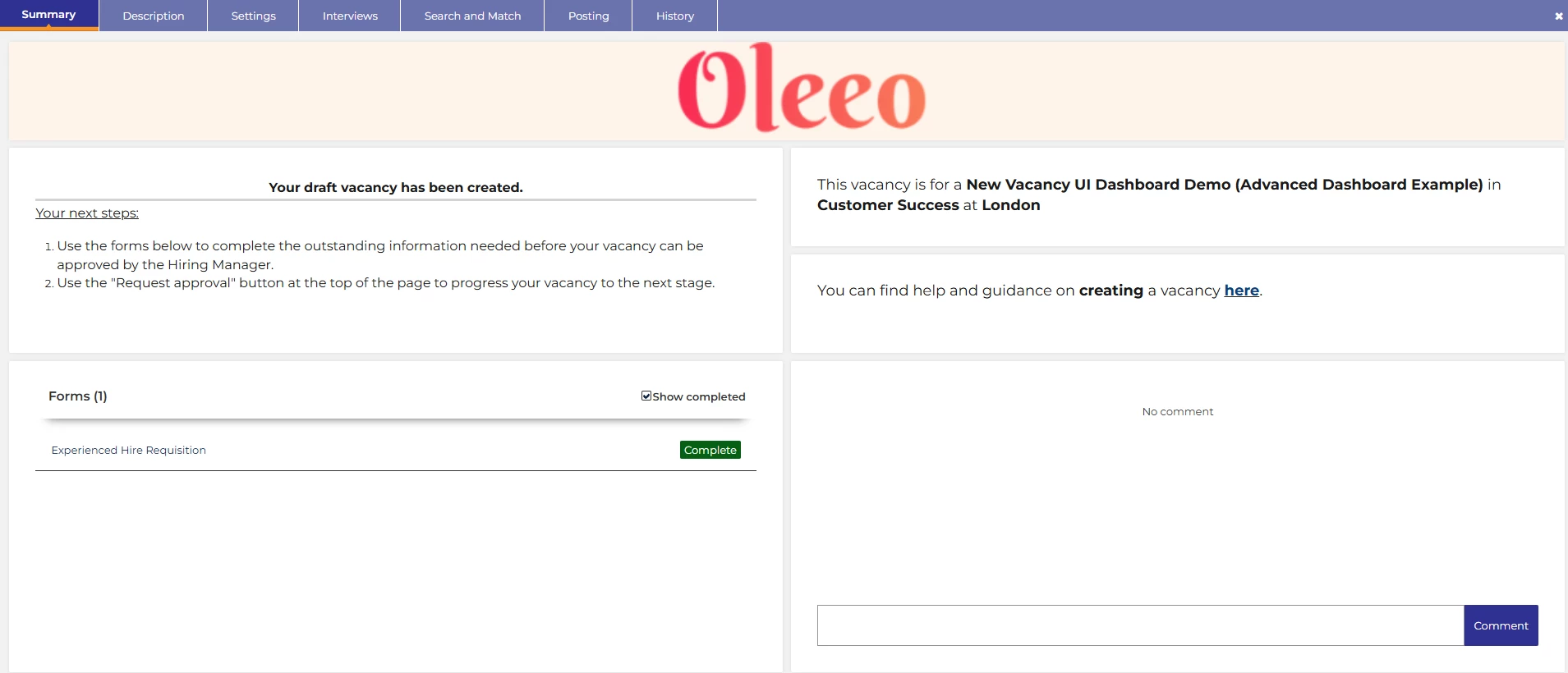
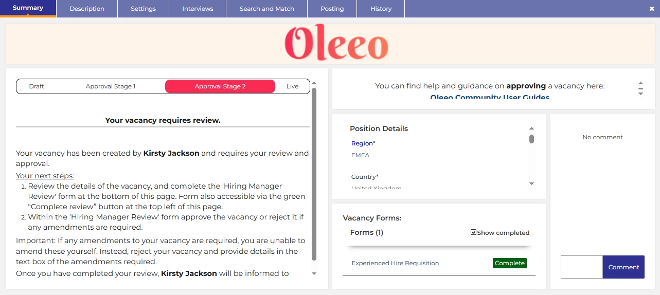
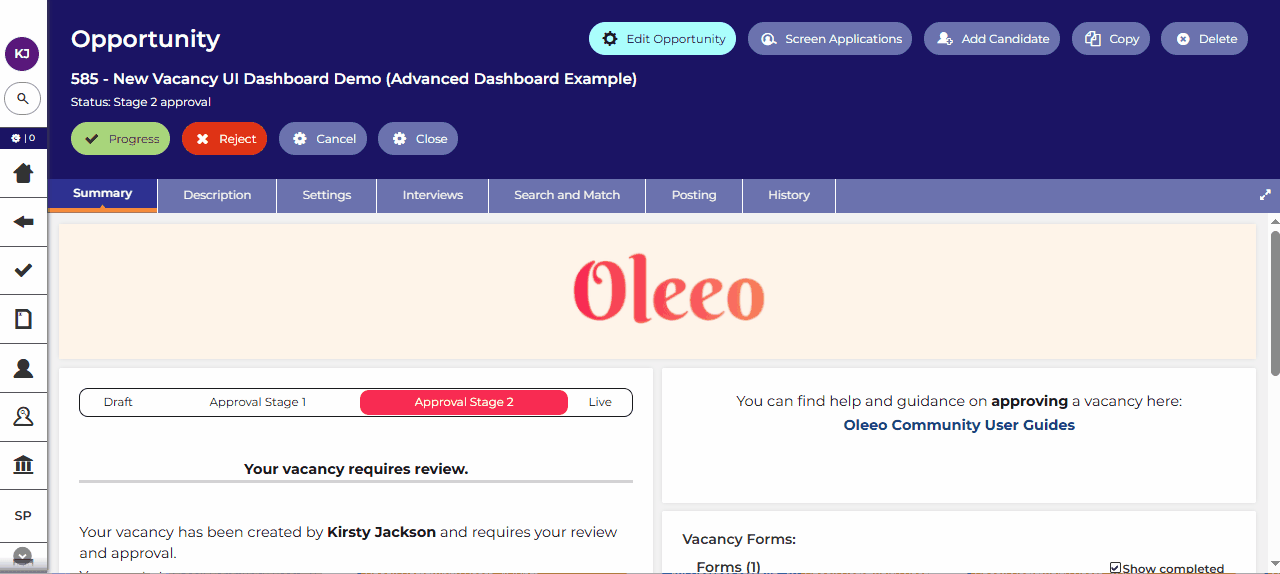
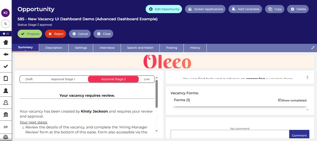
💡 Status = Approval:
- Progress bar for users to easily identify where their vacancy is in the process
- Simple instructions for your users - so they know exactly what is expected of them
- Access to all the forms that need to be completed (Applicable to Multi-form Vacancies Only)
- Links to additional guidance
- Comments for recording vacancy specific notes for other users and future reference
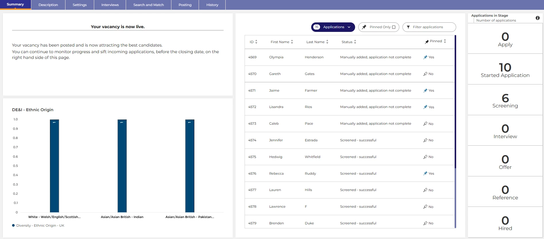
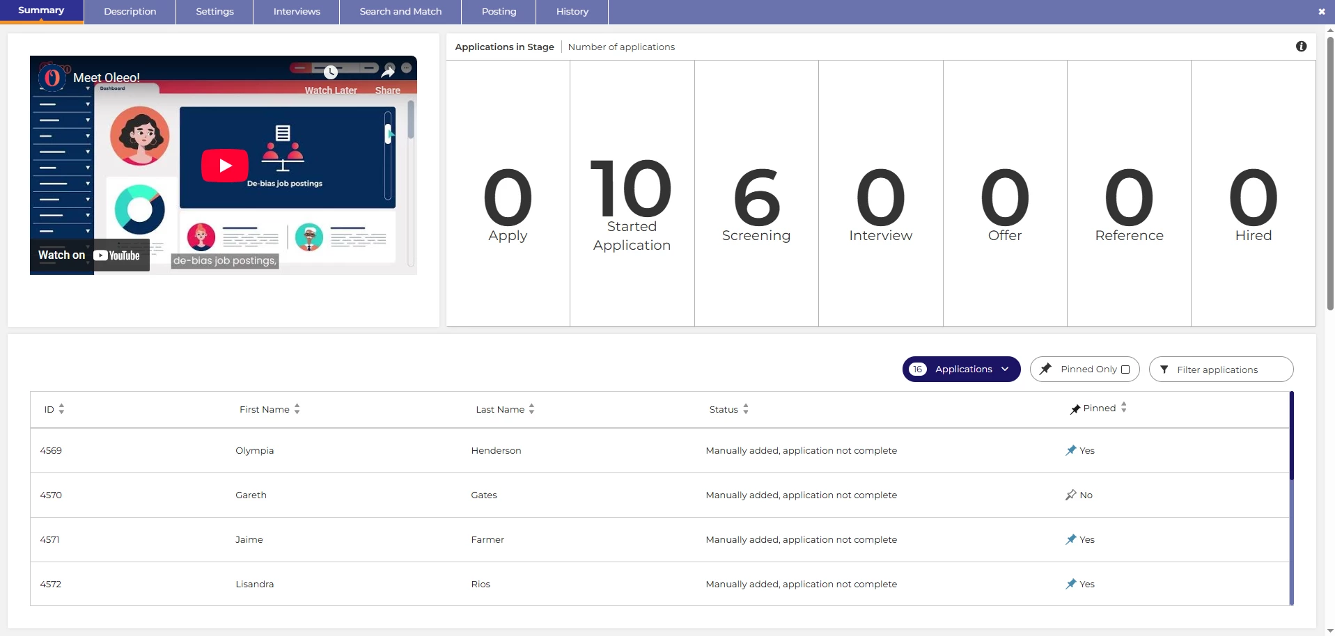
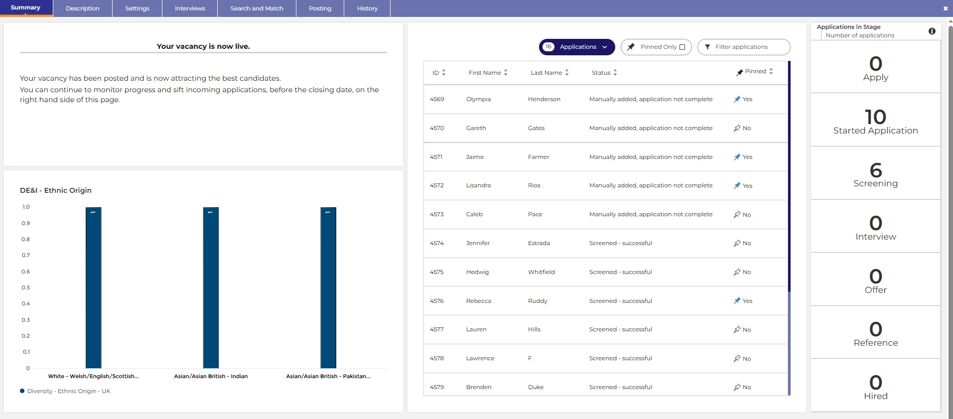
💡 Status = Live:
- Simple instructions for your users - so they know exactly what is expected of them
- A chart - show some key metrics
- Applications widget - quickly and easily manage your applications
- Applications in stage widget - give users a clear picture of how things are progressing with your applicants with direct access to the applicants in each stage
💡 Status = Closed:
- Basic vacancy specific reports to summarise the vacancy’s performance
📌 Pro Tip: In addition to having separate pages based on the vacancy status, you can also have different pages based on the role profiles too! Perhaps your recruitment team need different information to your line managers at a particular status?
❓ How do I create different pages for different statuses and different users? Check out our configuration guide linked at the end of this article for instructions!
Dynamic Instructions - Guide Your Users Through Their Tasks
💡 A key benefit! You can include a notes widget on your dashboard to inform and guide users at each stage of the vacancy process. This can change based on which profile they are using to reflect the activities they themselves need to complete in the system at any given time.
🔧 Use case: Would you like to offer your users the best experience in the system? Do you have occasional users who are unfamiliar with the system? Do you need different people to take different actions at each stage? Are you hoping to allow users to self serve and reduce the need for help from your sysadmin users? Clear guidance can help with all that.
💡 Data paths:
You can include data paths in notes widgets to give clear information to users relating specifically to that vacancy. For example:

💡 Status specific guidance notes:
Perhaps one of the most powerful tips for the occasional or first time user - you can put a notes widget into each page of your dashboard to guide them through what they need to do next.
You can then tailor these instructions using separate pages within your dashboard and adjust their visibility by role (as alluded to earlier) or you can use visibility rules to only show text to certain profiles: For example:
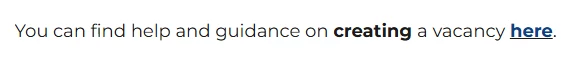
💡 Link to external guidance:
You can hyperlink words within your notes widgets to provide more in depth guidance, perhaps for your first time or occasional users. For example:
💡 Embed Instructional Videos:
You can embed instructional videos into a notes widget to further support your users. For example:
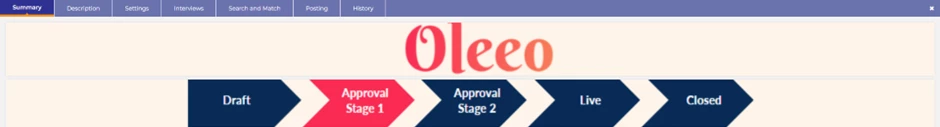
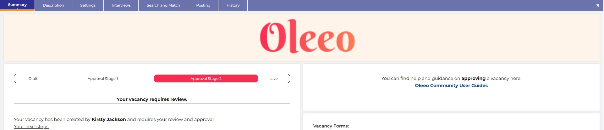
Include a Progress Bar - Highlight the Journey
💡 Keep your users informed about their vacancy progress with a progress bar. Like candidates, line managers or occasional users also benefit from knowing where they are in the journey — here are a few ways you can help them.
🔧 Use case: Do you have users who chase your recruitment team for their vacancy progress, perhaps you have several approval stages which can take some time? Keep them informed of where their vacancy is in the process to prevent those calls.
💡 Create and include an image:
You could produce an image to insert into your dashboard as an image component, for which you can have a different iteration for each stage of your process; uploading each version onto the relevant page of the dashboard.
💡 Add a manual progress bar into a notes widget:
You can use the source code in your notes widget to build a table to act as a progress tracker bar. This is a really neat and easily amendable way to introduce a progress tracker. It is using exactly the same logic as we showed you for introducing a progress tracker on your candidate portals in the TIP TUESDAY! article referenced at the end of this article.
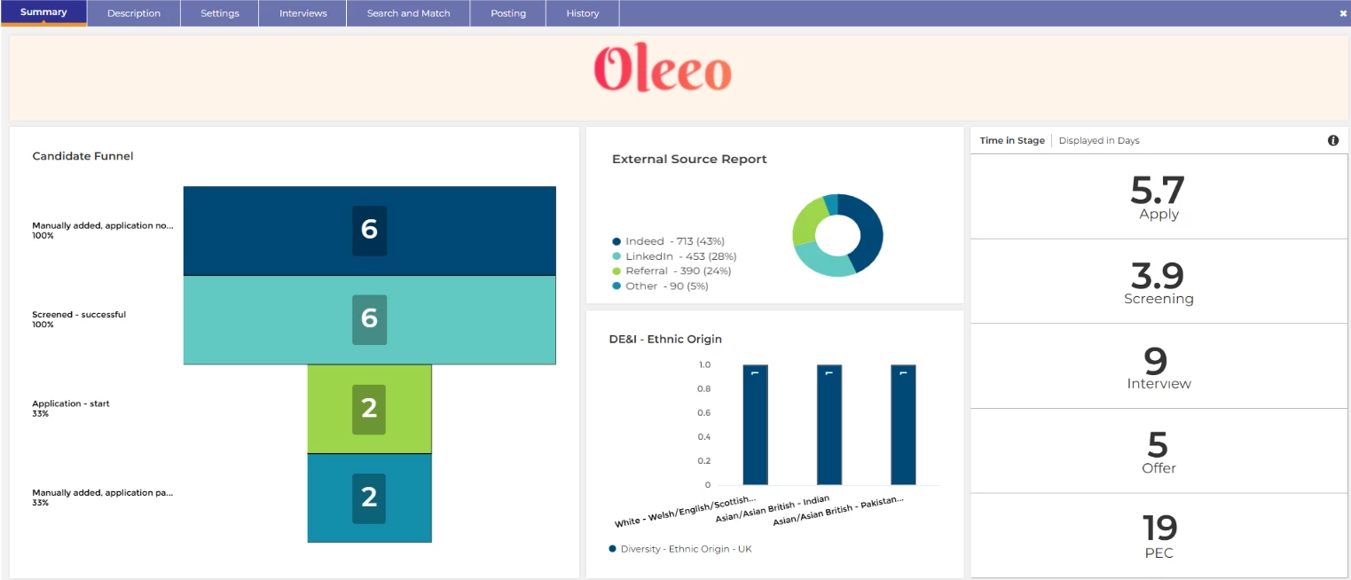
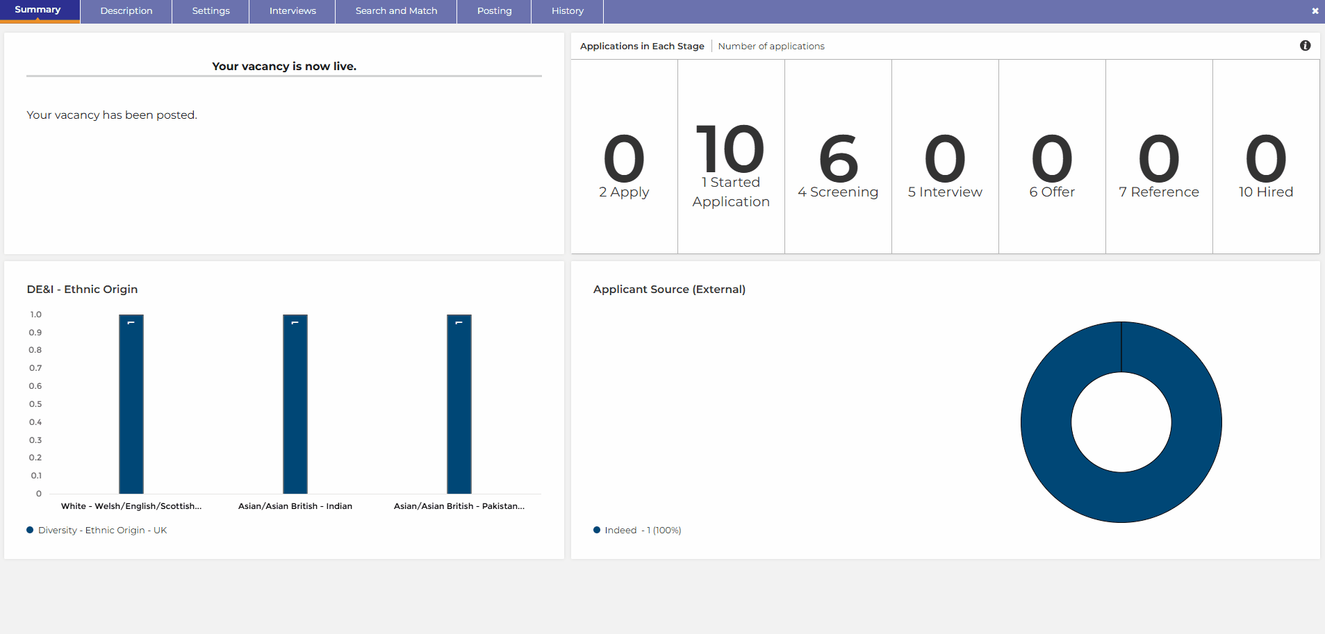
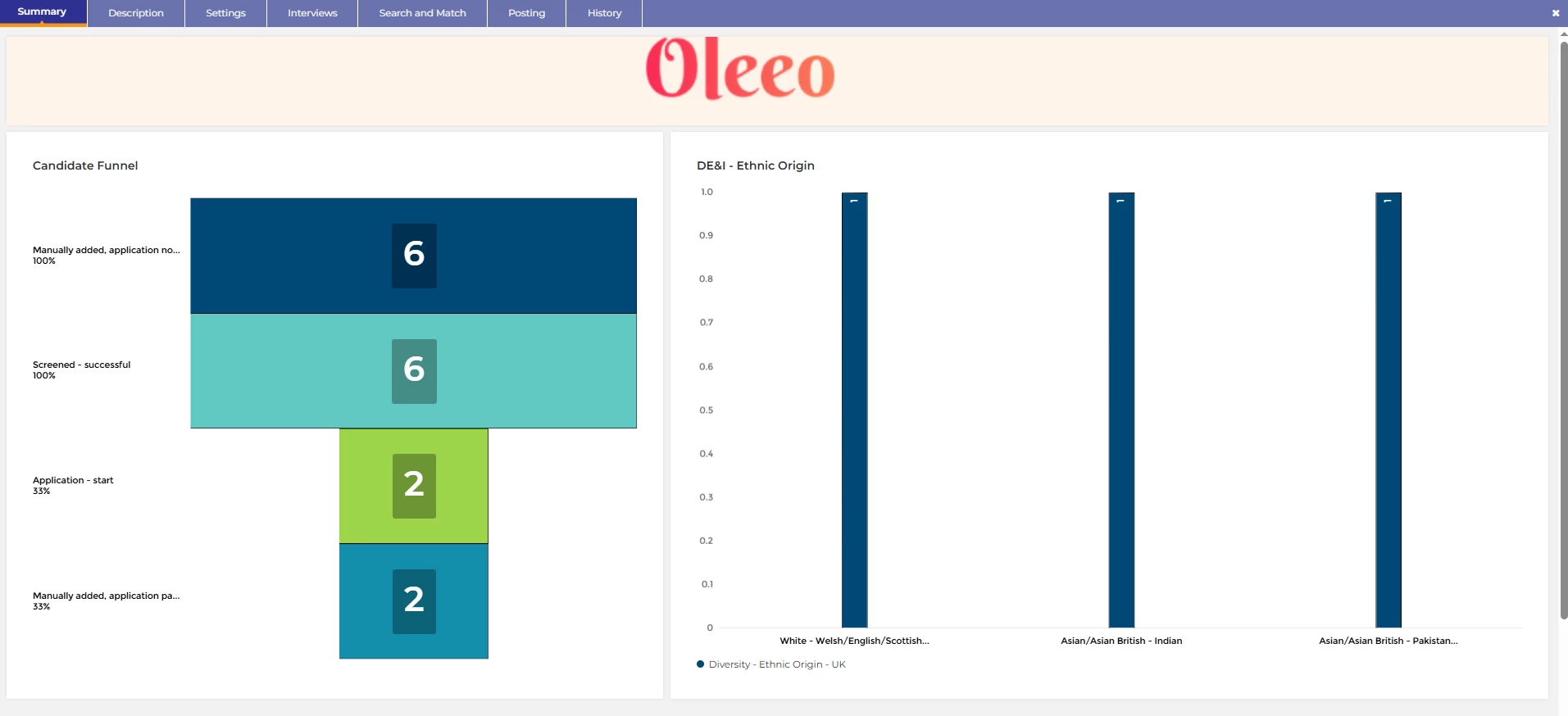
Real Time Metrics - Proactive Recruitment
💡 You can add vacancy specific report widgets to your dashboard to provide real time vacancy specific applicant data.
Do you have targets for certain protected characteristics that you need to meet? Would you benefit from being able to pivot your attraction strategy in real time to meet these targets? By having real time information, you can adjust your hiring campaign to give yourselves the best opportunity of meeting your targets.
🔧 Use case: Whether this is looking at applicant source or protected characteristics, having real time data gives you the visibility you need early on - giving you a chance to pivot any attraction strategies. For example: Posting to another diversity job board to increase the diversity of your applicant pool.
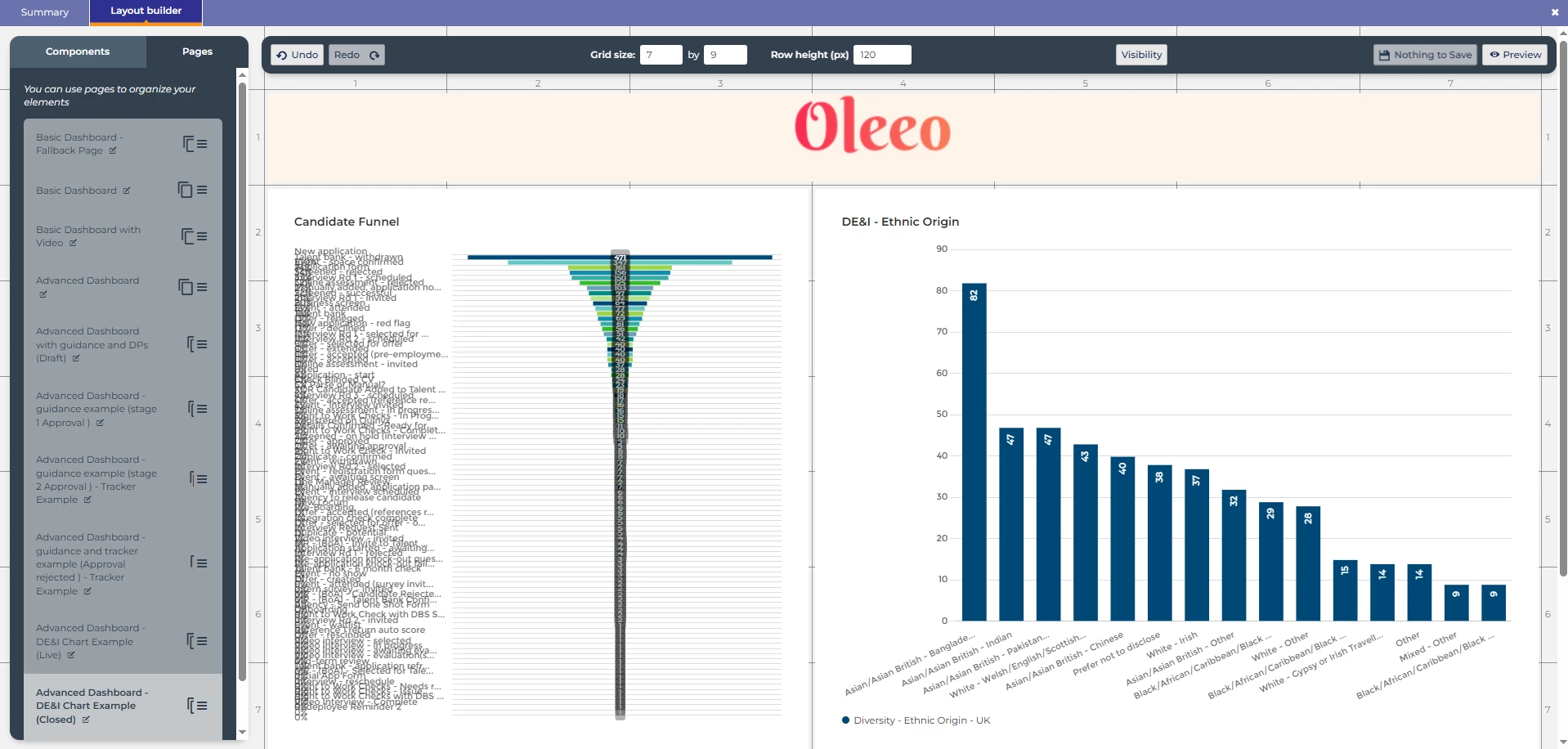
📌 Pro Tip: Test this in a configuration vacancy rather than the widgets layout builder! When you build it in the widget layout tool in config, the charts will look odd - however when you go into an actual vacancy in your configuration site, you will be able to clearly see how it would display applicant data. This is the best way to test any reports that you might wish to put on your dashboards.
Builder view:
Vacancy View:
Most Importantly - Keep it Simple!!!
💡 Keep it simple - Start small and go from there. It can be tempting to make the most of all the functionality available, but by doing that you may no longer see the benefit of a reduced cognitive load, and could slow your system down with the complexity. Find your balance.
😊 Have we given you any ideas? Have you done anything with your dashboards that we haven’t talked about? We’d love to hear what you have been working on, as would our other customers - please share your experiences below!
BENEFITS
- Guide your users seamlessly through your process
- Reduce the cognitive load
- Streamline the process for your users
- Present pivotal information at the right time to the right users
- Turn reactive recruitment into proactive recruitment with vacancy specific real time metrics
CONSIDERATIONS
You will need access to the ‘Widget Layouts’ element in the configuration environment which requires level 2 self configuration training.
COSTS
This feature is part of the standard product offering.
NEXT STEPS
Speak to our delivery team via a Change Request case on the Sugar portal if you would like us to build this for you.
Alternatively speak to your Customer Success Manager about how these could be useful for your organisation.
ADDITIONAL INFORMATION:
General update:
User Guide:
Configuration Guide:
TIP TUESDAY!


