
WHAT IS THE TIP?
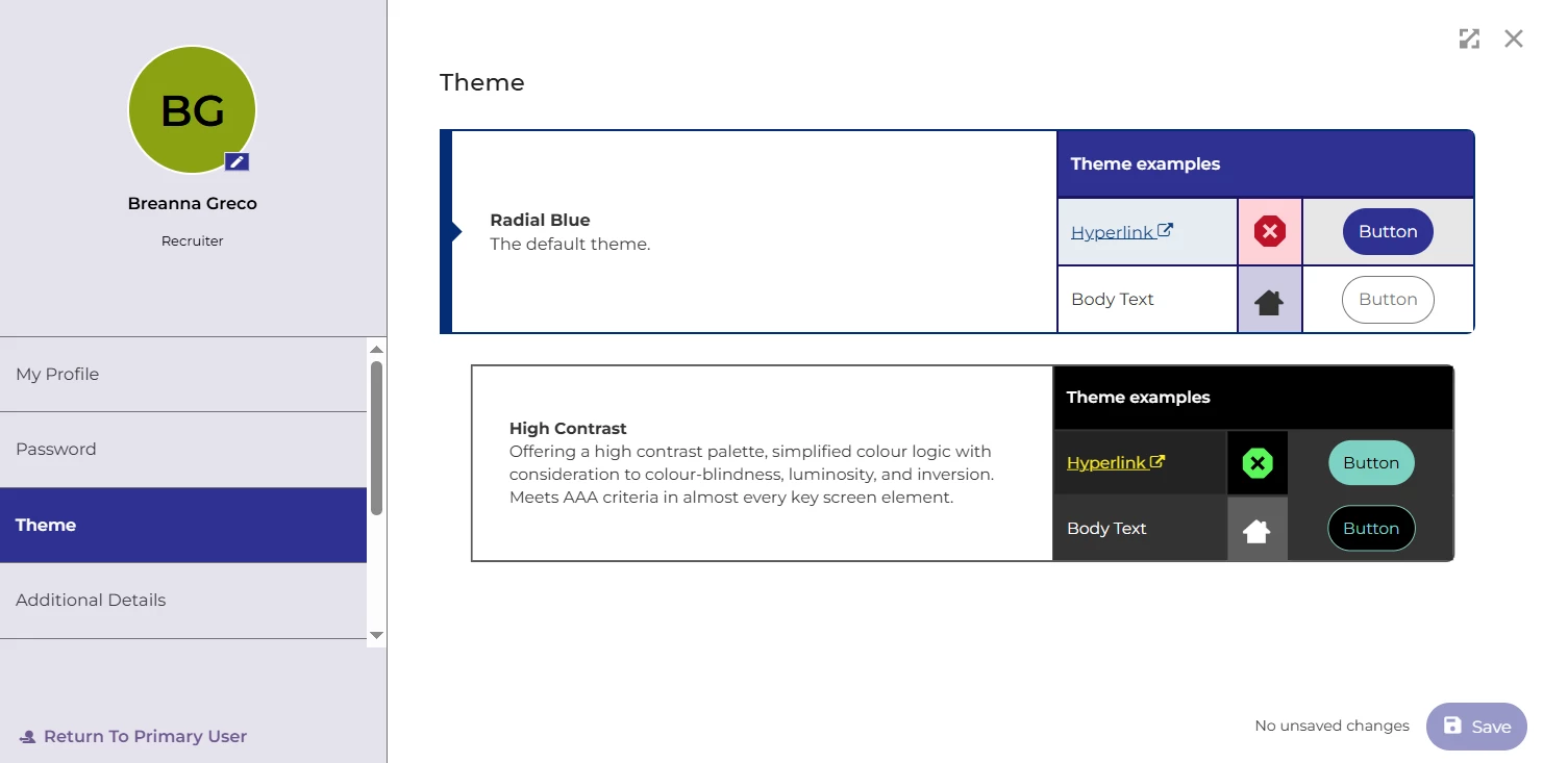
💡 Did you know you can switch your Oleeo theme to High Contrast? This theme offers a sharper, more accessible colour palette designed with colour-blindness, luminosity, and inversion in mind. It simplifies colour logic and meets AAA accessibility standards across almost every key screen element – making your ATS easier on the eyes and clearer to navigate.
How to switch your theme to High Contrast
💡 You can change your theme anytime from your personal settings.
-
Click your initials or avatar in the top-left corner of your screen.
-
Select Theme.
-
Change from Radial Blue (the default) to High Contrast.
If you’re working long hours or find the standard blue hard to read in certain lighting, try High Contrast for a cleaner, easier-on-the-eyes experience.
🔧 Use case: I spend most of my day reviewing applications, and after a few hours, the standard colours can start to blur together. Switching to High Contrast makes everything crisper, helps highlight key actions and statuses, and reduces eye strain.
😊 Have you tried the High Contrast theme yet? Let us know your thoughts – do you find it clearer or prefer the classic look?
BENEFITS
-
Improves accessibility for colour-blind and visually impaired users
-
Meets AAA standards for contrast and readability
-
Reduces eye strain for users working long hours
-
Provides a cleaner, more defined look across the system
COSTS
This feature is part of the standard product offering.
ADDITIONAL INFORMATION


