You can incorporate various components — static content, charts, and analytics — into your Report Hub grid. This guide explains how to add components and provides examples of use cases for each component type.
ADDING A COMPONENT TO YOUR REPORT HUB GRID
You can incorporate various components — static content, charts, and analytics — into your Report Hub grid. Follow these steps:
- Prepare Data Tables:
- Before adding charts or analytics, create data tables as the data source. Learn how to do this in the data table creation guide.
- Navigate to the 'Report Builder' Tab:
- Access the 'Report Builder' tab within your Report Hub.
- Select Component Type:
- In the report builder menu to the left of the grid, click the static content, chart or analytic you wish to add.
- Place the Component:
- Click the cell in the grid for the component's top left-hand corner.
- Click another cell for the component's bottom right-hand corner.
- Complete the the fields in the pop-up window:
- Fields vary based on the component type.
- For all components:
- It is optional to provide a title and description.
- Text entered here will appear above the component in the report.
- For charts, select the Statistics Report and Limit Categories:
- Statistics Report:
- Choose the Data Table as the data source (mandatory).
- Limit Categories:
- Use this field to restrict the number of categories shown in the chart.
- The default is 10.
- To ensure all categories are included, enter an sufficiently large number.
- Statistics Report:
- Add the report
- Click 'Update' to add the report.
Remember to Save Changes:
- The report does not automatically save when a new component is added.
- Make sure you click the 'Save Changes' button in the grid toolbar before navigating away from the page.
OVERVIEW OF 'STATIC CONTENT' COMPONENTS
Image
When to use:
- The Image component allows you to upload and add images directly to your report.
Example use case:
- Include your company logo or banner at the top of the report.
Rich Text
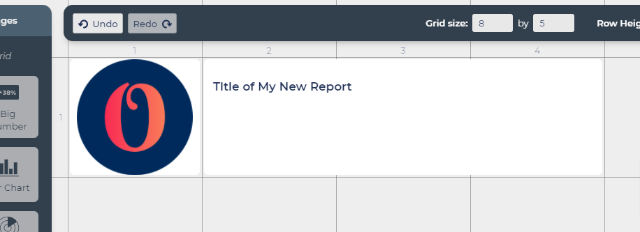
When to use:
- The Rich Text component empowers you to incorporate text boxes into your report.
Example use cases:
- Add a title at the top of your report for a clear presentation.
- Enhance report comprehension by inserting additional text to explain charts or provide context.
OVERVIEW OF 'CHARTS' COMPONENTS
Line Chart
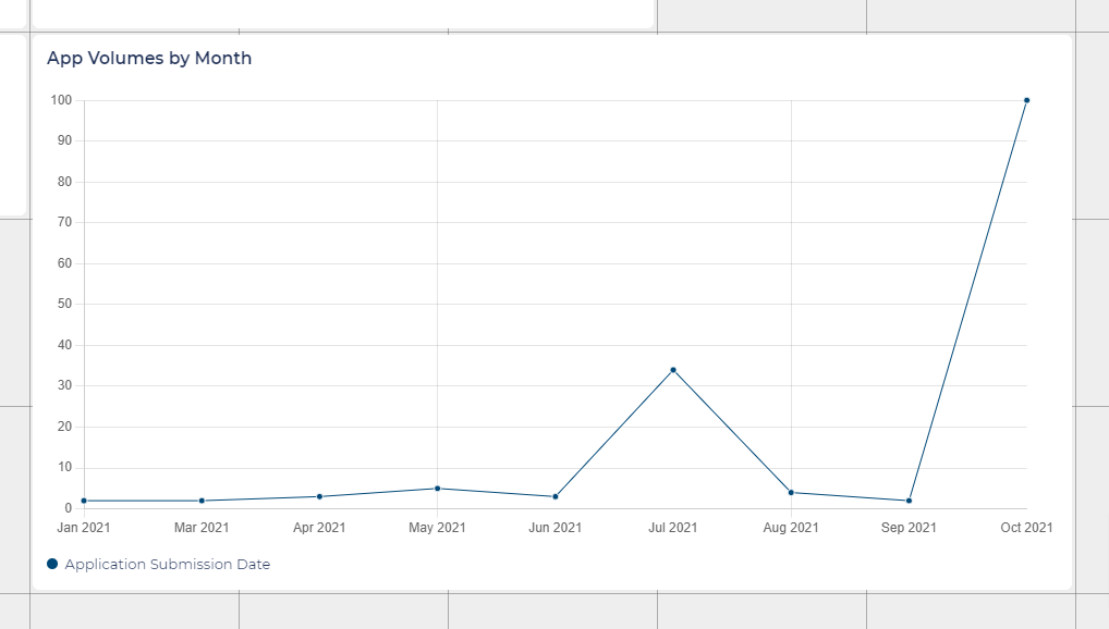
When to use:
- Effective for showing trends over time.
Example use cases:
- Illustrate the volume of applications submitted each month.
- Illustrate the volume of candidates hired each month.
Line Charts can only represent 1 axis:
- Line charts will always represent the first axis of your chosen statistics report.
Bar Chart
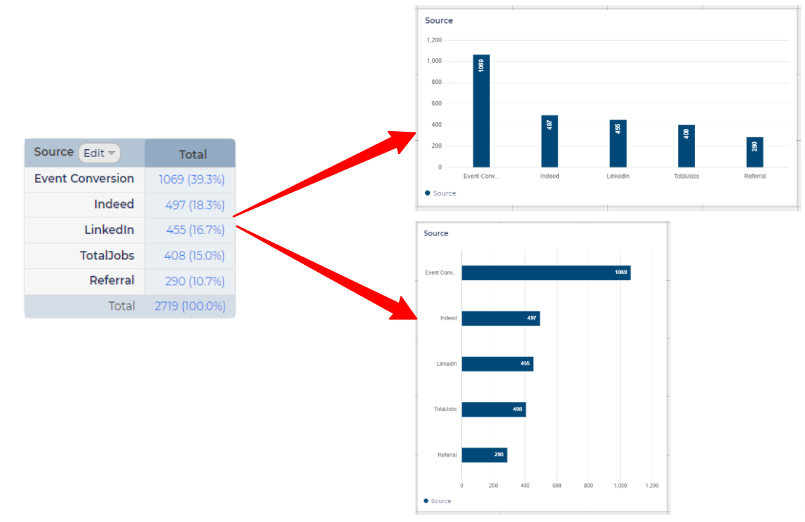
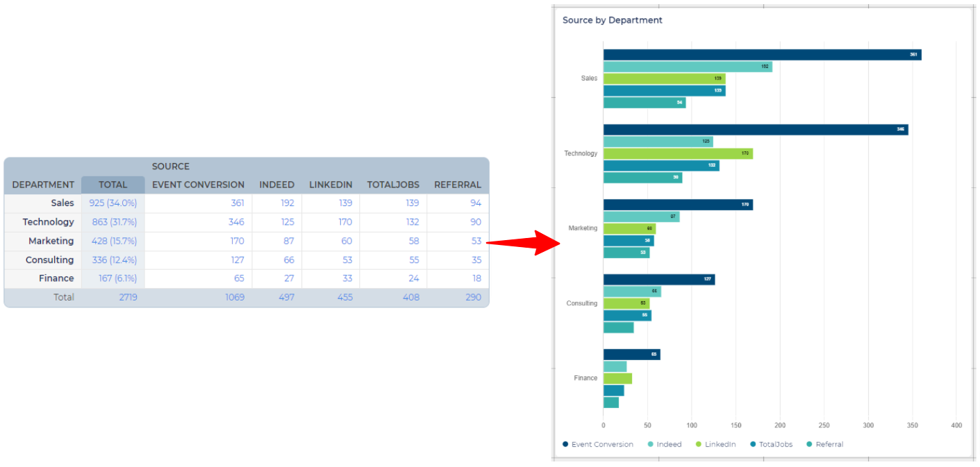
When to use:
- Useful for comparing the quantities of different categories.
- Effective for comparing a large number of categories.
Example use cases:
- Illustrate the volume of applications in each status.
- Illustrate the volume of opportunities created for business area.
Additional options for Bar Charts:
- Bar Orientation - Here you can set the orientation of the bar chart to Vertical or Horizontal. By default, the value will be set to Vertical.
Statistics Reports setup for Bar Charts:
The setup of the Statistics Report will impact the way the data is displayed in a bar chart.
- Statistics Report only has vertical axes:
- If the Statistics Report table only has vertical axes, only the first axis will be represented in the bar chart.
- Statistics Report has vertical and horizontal axes:
- The first vertical axis and the horizontal axis will be displayed in the report.
- In the grouped bar chart (otherwise known as a clustered bar chart), each group will represent a value from the first vertical axis and each bar will have a colour that corresponds to a value from the horizontal axis (see above examples).
Stacked Bar Chart
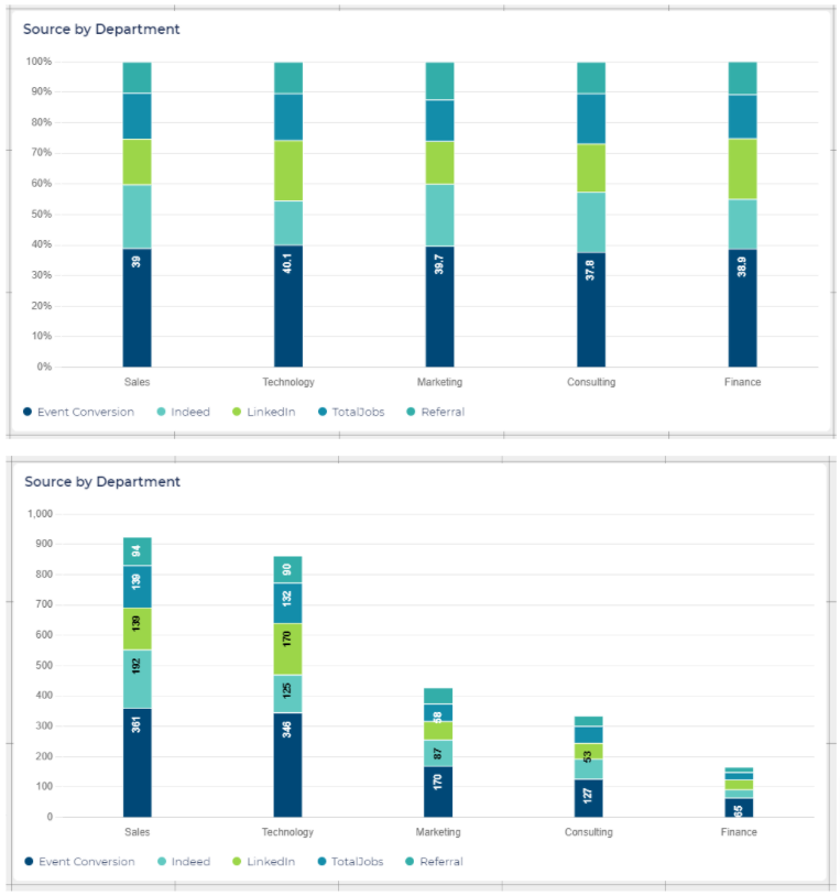
When to use:
- Effective for showing the composition of a whole over different categories.
- Useful for displaying the total and the sub-components within each category.
Example use cases:
- Illustrate the gender breakdown for each stage.
- Illustrate how many applications have been made to each region split by country.
Additional options for stacked bar charts:
- Bar Orientation - As with bar charts, you can set the orientation of the stacked bar chart to Vertical or Horizontal. By default, the value will be set to Vertical.
- Value Scale - Choose between two value scale options for stacked bar graphs:
- 'Absolute' - Sizes each segment in relation to the absolute value it represents on the scale. Helpful for comparing the exact values of individual components in the stacked bar.
- 'Percent' - Sizes each segment in relation to the percentage it represents of the entire stacked bar. Useful for understanding the proportional contribution of each component to the bar's total.
- Value breakdown tooltip on hover - By default, this feature is enabled, allowing you to display a detailed value breakdown in a tooltip when hovering over a bar in the chart. The tooltip will always show the absolute value. You can hide the tooltip to avoid distracting viewers from the visual chart.
Statistics Report setup for Stacked Bar Charts:
Ensure your Statistics Report is configured appropriately for effective data representation:
- Vertical and Horizontal Axes:
- The Statistics Report providing data should include both a vertical and a horizontal axis.
- Main Category:
- The first vertical axis in the Statistics Report is always designated as the main category.
- Sub-Category:
- The horizontal axis serves as the sub-category.
- Handling Multiple Axes:
- If the Statistics Report contains 2 vertical axes and one horizontal axis, the first vertical axis becomes the main category, and the horizontal axis becomes the sub-category. The second vertical axis is disregarded.
Pie Chart
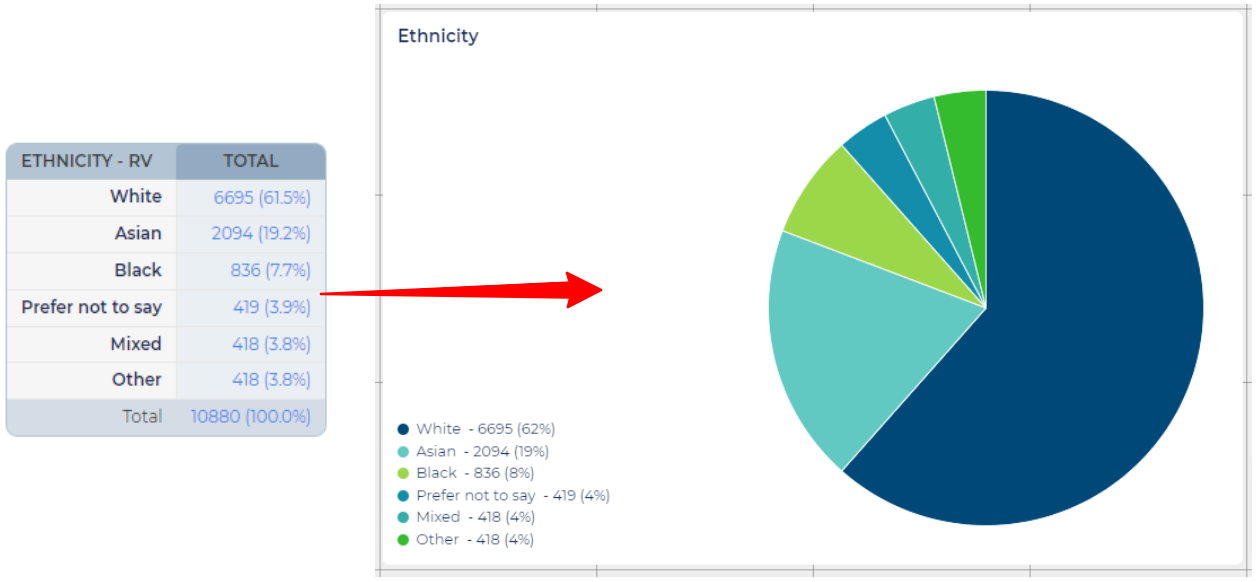
When to use:
- Ideal for illustrating the proportion of parts to a whole.
- Suitable for representing percentages or proportions.
- Use with a limited number of categories for clarity.
Example use cases:
- Display the diversity composition within the candidate pool. Each slice can represent a specific diversity category, giving a visual representation of diversity percentages.
- Visualise the distribution or proportion of responses to binary questions such as 'Yes' or 'No'.
- Represent the distribution of candidates from different sources. Each slice of the pie could represent a different source, providing a quick visual comparison.
Additional options for Pie Charts:
- Numerical values in legend - Pie charts automatically display a legend (key) that, by default, includes both the absolute and numerical values for each category. You have the option to hide the numerical values so that the focus is solely on the proportions.
Statistics Report setup for Pie Charts:
- Pie charts are designed to represent data from a single axis of a Statistics Report.
- Regardless of the number of axes in your chosen Statistics Report, the pie chart will always use data from the first vertical axis.
Doughnut Chart
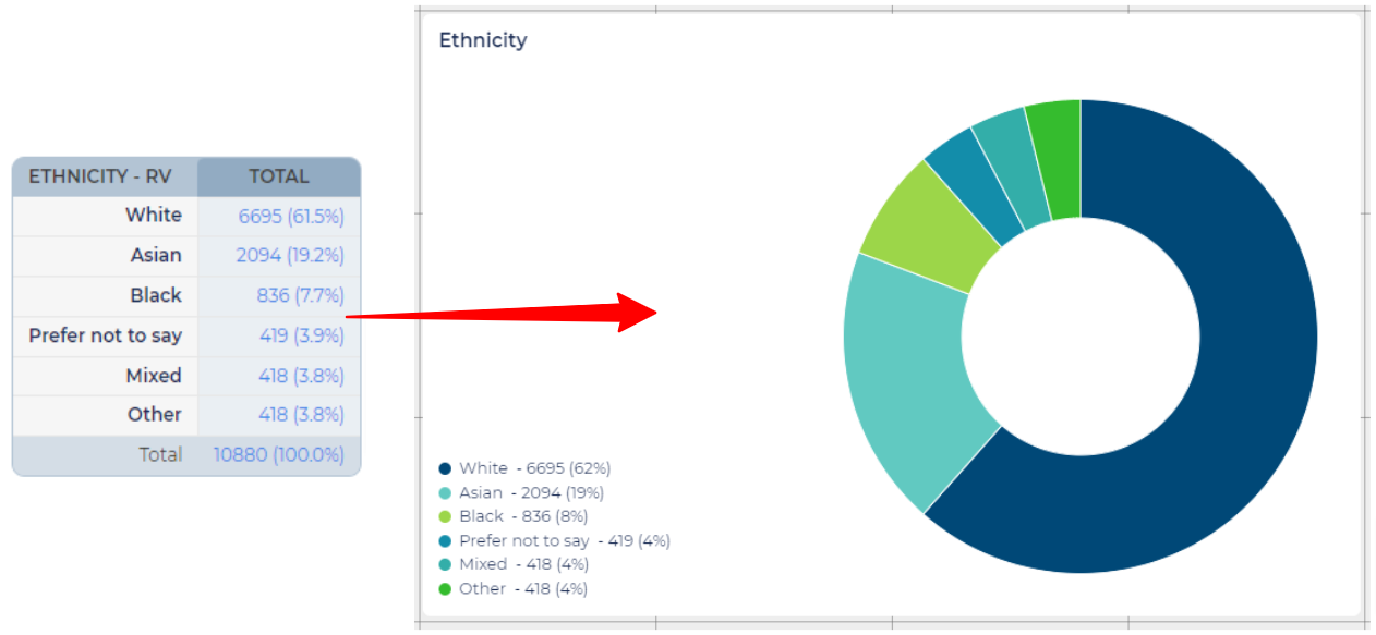
When to use:
- If you are aiming for a more modern or visually appealing design, doughnut charts are often considered sleeker than pie charts.
- In situations where space is limited, and you need to convey information in a small area, a doughnut chart can be more space-efficient and less cluttered.
- Note, the name "doughnut" refers to the chart's likeness to the American-style ring-shaped doughnut, rather than the jam-filled doughnut popular in the UK.
Example use cases:
- Can work in all the scenarios described for pie charts.
Additional options for Doughnut Charts:
- Numerical values in legend - As with pie charts, doughnut charts automatically display a legend that, by default, includes both the absolute and numerical values for each category. You have the option to hide the numerical values so that the focus is solely on the proportions.
Statistics Report setup for Doughnut Charts:
- Doughnut charts are designed to represent data from a single axis of a Statistics Report.
- Regardless of the number of axes in your chosen Statistics Report, the doughnut chart will always use data from the first vertical axis.
Radar Chart
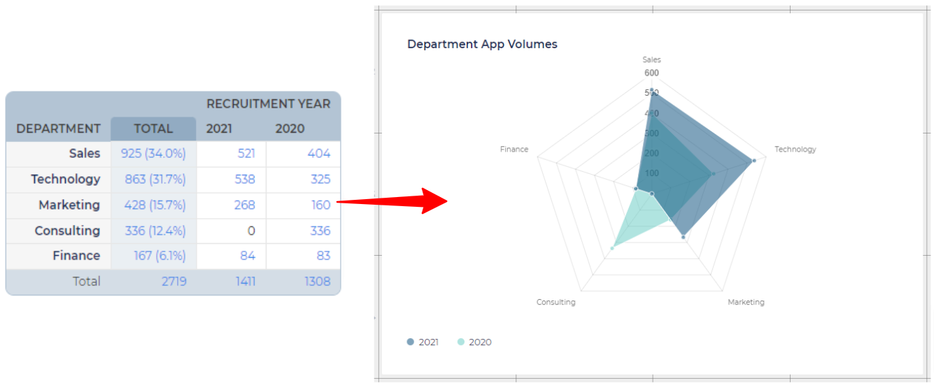
When to use:
- Use radar charts when you want to compare things by looking at many different parts all at the same time.
Example use cases:
- Compare how the distribution of answers has changed between 2 years.
Additional options for Radar Charts:
- Value breakdown tooltip on hover - By default, this feature is enabled, allowing you to display a detailed value breakdown in a tooltip when hovering over a bar in the chart. The tooltip will always show the absolute value. You can hide the tooltip to avoid distracting viewers from the visual chart.
Statistics Reports setup for Radar Charts:
The setup of the Statistics Report will impact the way the data is displayed in a radar chart.
- Statistics Report only has vertical axes:
- If the Statistics Report table only has vertical axes, only the first axis will be represented in the radar chart.
- Statistics Report has vertical and horizontal axes:
- The first vertical axis and the horizontal axis are utilised to generate the radar chart.
- Each spoke on the chart represents values from the first vertical axis.
- Colours represent each value along the horizontal axis.
- Typically, it's advisable to use the axis with the most values as the vertical axis for clarity.
Polar Area Chart
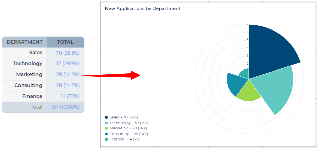
When to use:
- Polar charts are ideal when you want to emphasise the magnitude of values, showcasing how different factors vary in size or importance.
- They provide a visually appealing method for comparing contributions or importance of different factors relative to the whole.
Example use cases:
- Can be great for demonstrating that a high proportion of candidates come from particular sources.
Additional options for Polar Charts:
- Numerical values in legend - Polar charts automatically display a legend that, by default, includes both the absolute and numerical values for each category. You have the option to hide the numerical values so that the focus is solely on the proportions.
Statistics Report setup for Polar Charts:
- Polar charts are designed to represent data from a single axis of a Statistics Report.
- Regardless of the number of axes in your chosen Statistics Report, the polar chart will always use data from the first vertical axis.
Funnel Chart
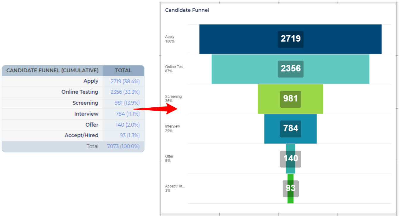
When to use:
- Use to represent stages in a process, where the number of values decreases progressively from the initial stage to the final stage.
Example use cases:
- Ideal for visualising the Recruitment Funnel, from the initial application stage to shortlisting, interviews, offers and hire.
- The funnel can show the decreasing number of candidates that reach each stage.
Statistics Report setup for Funnel Charts:
- View our step-by-step guide: Creating a Recruitment Funnel.
- Funnel charts are designed to represent data from a single axis of a Statistics Report.
- Regardless of the number of axes in your chosen Statistics Report, the funnel chart will always use data from the first vertical axis.
OVERVIEW OF 'ANALYTICS' COMPONENTS
Pivot Table
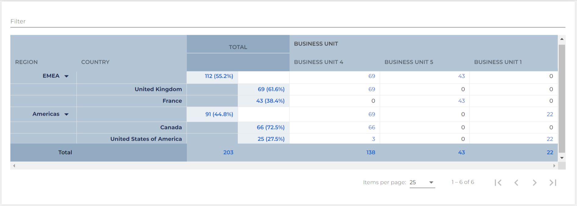
When to use:
- If your audience prefers raw numbers over visual charts.
- When a structured table suits the audience's preference for inspecting and analysing data.
- When you want to compare data across three or more fields effectively.
Example use cases:
- Display the number of applications submitted to each region, split by country and division.
Additional options for Pivot Tables:
- Cannot limit the number of categories - Unlike charts, you do not have the option to limit the number of categories.
- Defaults to displaying 25 items per page - When a Pivot Table is added to the grid, it will default to displaying 25 items per page (i.e. 25 rows of the report).
- Adjustable display when viewing the report:
- Adjust the display to show 50 or 100 items per page using the dropdown at the bottom of the report.
- Utilise the top filter to focus on specific data within a category or sub-category.
- Collapse a category in the first vertical axis to hide its sub-categories in the second vertical axis when working with two vertical axes.
- Switch pages - You can navigate between the pages by using the arrows to the right of the dropdown.
Statistics Report setup for Pivot Tables:
- When added to the Report Hub as a Pivot Table, the Statistics report displays over multiple pages if there are more than 25 items. Adjust the view to show 50 or 100 items per page, as described above.
Big Number
When to use:
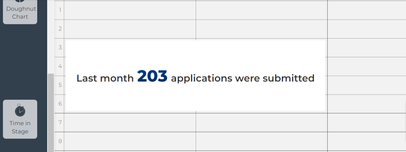
- Use when you want to emphasize a single key metric or value that holds significant importance.
Example use cases:
- Highlight the total number of open opportunities.
- Highlight the number of applications hired last month.
- Highlight the number of applications from under-represented groups.
Additional options for Big Numbers:
- Prefix - Use this field to add text before the number.
- Postfix - Use this field to add text after the number.
Statistics Report setup for Big Numbers:
- This component will display the total number in the table of your chosen Statistics Report.
- Key consideration: Define the criteria for the total number by setting the Population, such as 'Submission Date' greater than or equal to '1st Jan this year'.
- Axes:
- At least 1 axis is required; otherwise, the Big Number will display zero.
- If the axis includes a status or stage field, avoid setting it as 'cumulative' to ensure the Big Number reflects the total number of applications or vacancies, not statuses used.
Time in Stage

When to use:
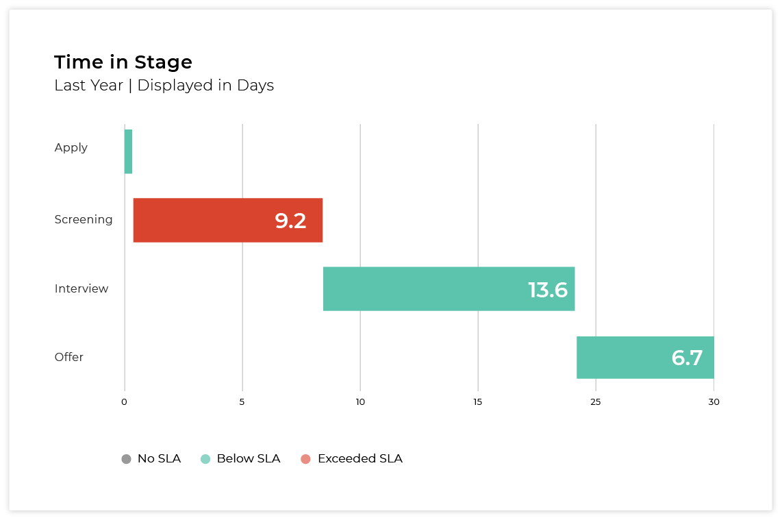
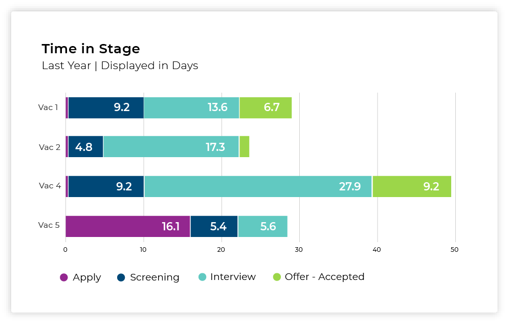
- To see how long, on average, candidates are spending in each stage of the recruitment process.
Example use cases:
- Measure your time-to-hire for a specific time period or population of vacancies.
- Pinpoint stages in the recruitment process where candidates tend to spend an unusually long time.
- Compare "Time in Stage" metrics across different vacancies.
Process for adding a Time in Stage report:
- Set up the Status Groups in your Configuration Environment corresponding to the stages in your recruitment process (Self-Configuration Level 1 access required).
- Each Status Group should include all of the active statuses in the stage.
- Set up the Reporting Stages in your Live Environment.
- Add Time in Stage component to a Report Hub, using the Reporting Stages you created.
View our step-by-step guide: Creating a Time in Stage report
Applications in Stage
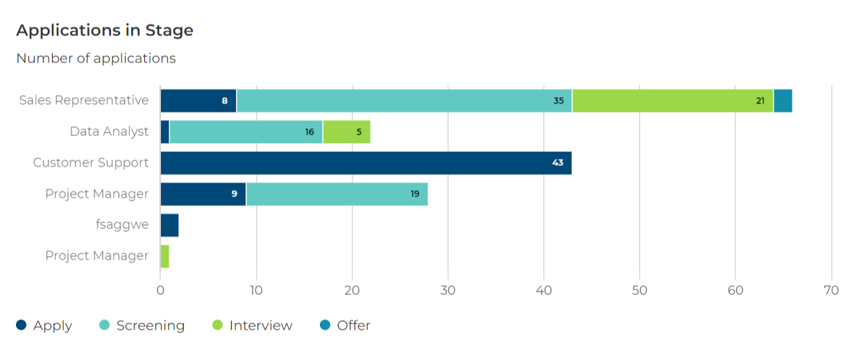
When to use:
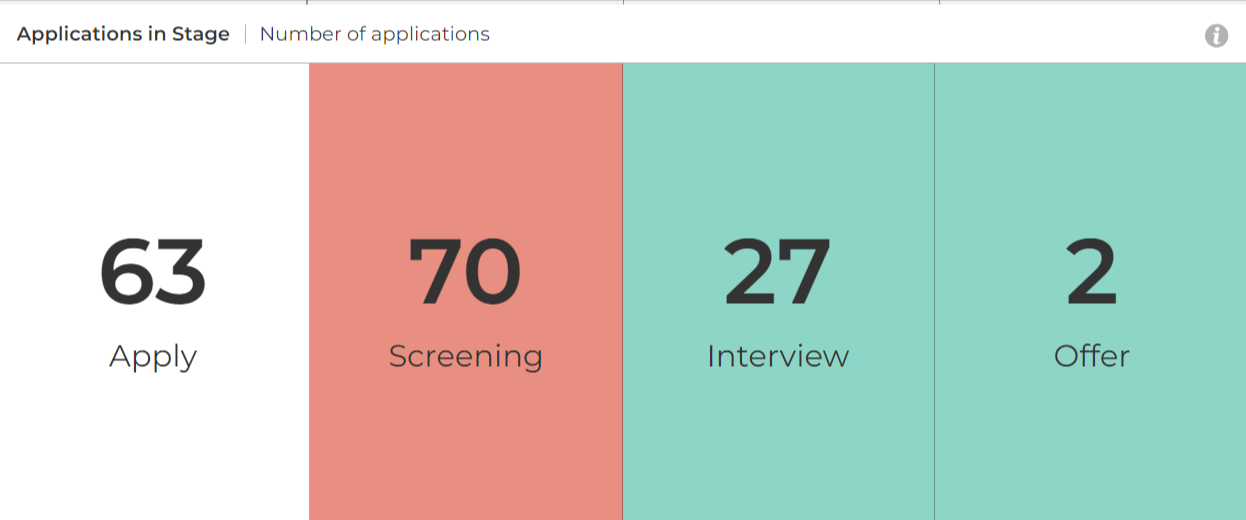
- See the raw number of applications currently at each stage.
Example use cases:
- Highlight stages in the recruitment process where a significant number of applications are accumulating, signalling potential bottlenecks.
Process for adding an Applications in Stage report:
The process of creating an Applications Stage report closely mirrors that of a Time in Stage report. Notably, you can leverage the same Status Groups and Reporting Stages for both reports, streamlining the setup process and ensuring consistency between the two analyses.
- Set up the Status Groups in your Configuration Environment corresponding to the stages in your recruitment process (Self-Configuration Level 1 access required).
- Each Status Group should include all of the active statuses in the stage.
- Set up the Reporting Stages in your Live Environment.
- Add Applications in Stage to a Report Hub, using the Reporting Stages you created.
View our step-by-step guide: Creating an Applications in Stage report


