


NEW SCREEN APPLICATIONS UI
We are thrilled to announce the launch of our New Screen Applications User Interface!
We’ve listened to your feedback and built a tool specifically designed to empower your recruiters. Say goodbye to unnecessary clicks, multiple page loads, and endless tab-switching. Everything your team needs to locate, access, and screen applications is now available in one super-easy-to-navigate interface.
Check out this quick video overview of the new feature in action:
WHY YOU’LL LOVE IT
This new feature is built to revolutionize how you screen and evaluate applications within your Oleeo ATS. Here is what you can expect:
- Supercharged Efficiency: Screen more applications in less time. By minimising manual effort and streamlining daily tasks, recruiters can reduce their administrative burden and focus on what matters most: candidate engagement.
- A Superior User Experience: Enjoy a seamless, intuitive interface designed for maximum comfort and speed. We've consolidated all essential information into one centralised location so you can navigate with fewer clicks and zero tab-switching.
- Measurable Cost Savings: Optimise your recruiters' time and drastically reduce the manual processes that slow down your pipeline, ultimately helping to lower your cost-per-hire.
- Built to Scale: Whether it is a standard week or a peak hiring period, this modern, adaptable tool makes managing high volumes of applications a breeze.
HOW DOES IT WORK?
Getting to the new interface is simple. Just click the New Screen Applications button directly from your Vacancy Overview Screen (don't worry, no existing parts of the system are affected!).
Once inside, you'll find a beautifully optimized, clutter-free view that provides exactly what you need for this stage of the process. The workspace is divided into three customizable, dedicated columns:
- Candidate Navigation (Red): Easily jump between applicants.
- Application Form & CV/Resume Review (Blue): Review candidate credentials clearly.
- Feedback Form Update & Submission (Green): Log your evaluations instantly.
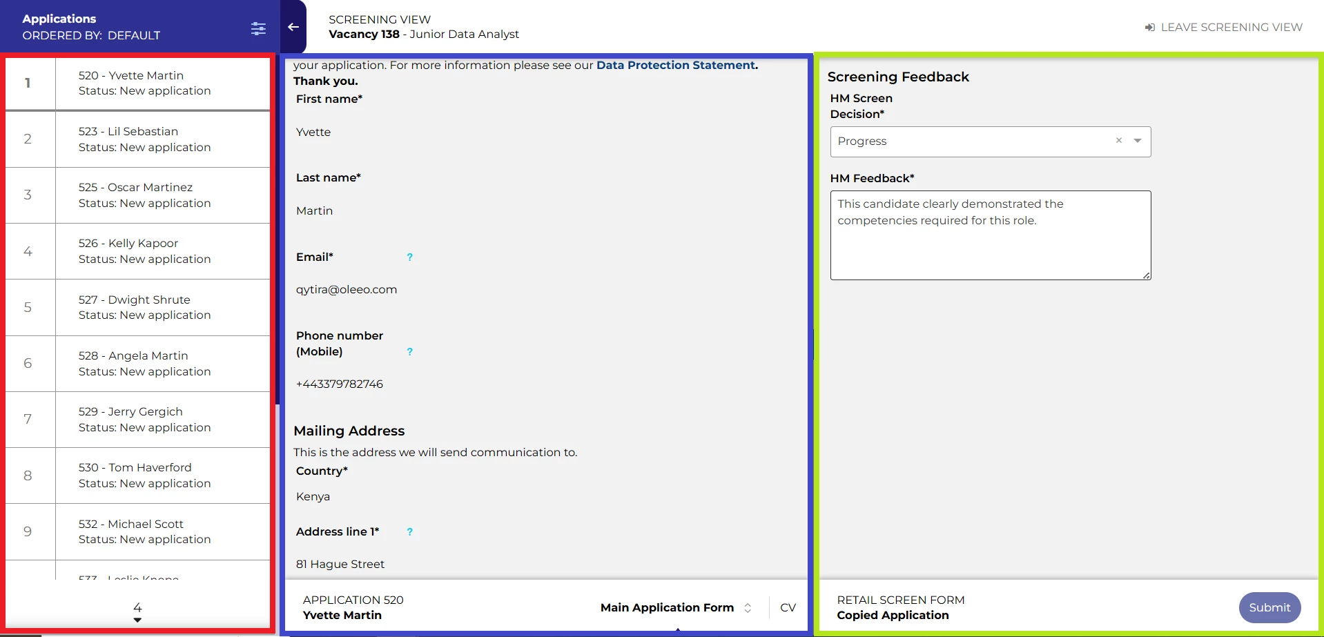
The best part? You can screen applications, fill out feedback forms, and progress or reject candidates using standard process flow buttons—all without ever having to reload the page or change screens!
CONSIDERATIONS
Prerequisite Check: To take advantage of the new Screen Applications UI, you must already have the New Vacancy Management Interface added to your system and pushed to live.
NEXT STEPS
Speak to your Customer Success or Commercial Manager for any additional information.
COSTS
Good news on costs: This feature is part of our standard product offering, meaning the standard version comes at no extra cost to you!
Please speak to your Commercial Manager for further information.
ADDITIONAL INFORMATION
