


WHAT IS THE TIP?
💡 When it comes to reporting, it’s not just about numbers - it's about telling a story with your data. Oleeo’s "View All Reports" or "Standard Reports" functionality allows you to create pivot tables, providing a great first step in building visually appealing reports in Report Hub or for quick, insightful data analysis.
Let’s dive into the essential tools and features that will help you craft meaningful reports, keep them organised, and guide you in telling the story you want to share!
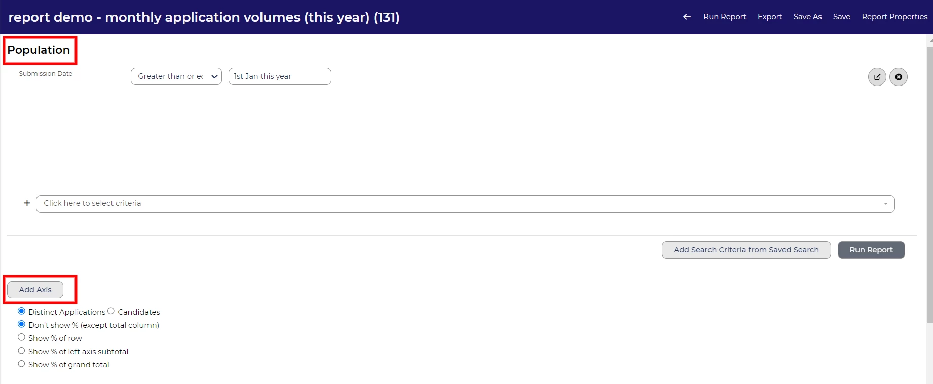
Demystifying Population and Axis
💡 Many users find the split between Population and Axis in Oleeo reports a bit tricky at first. Think of Population as your saved search - it helps you zero in on the specific data you want to analyse. On the other hand, Axis is like setting up a table layout - it positions how that data is displayed in your report. Together, they work like a team: Population hones in on the data you need, and Axis determines how it's presented.
Rollup Lists: Simplifying Complex Data
💡 When building reports, the key is to tell the story you want to convey. Using Rollup Lists, you can organise complex data into categories that make your insights more impactful. For instance, if you’re reporting on ethnicity and have 15+ lookup options, a rollup list lets you group these into broader categories, such as "BAME" or "White." You can then pull the rollup into your report meaning the data focuses on the bigger picture; helping your report highlight key trends or diversity efforts, without being bogged down by granular details.
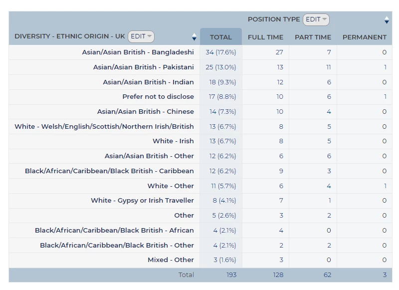
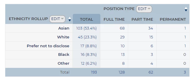
🔧 Use Case: By grouping ethnicity options into categories, your reports become easier to digest and helps you stay focused on the bigger picture - whether it's tracking diversity hiring efforts or workforce representation.
Minimum Percentage Threshold: Filtering Data for Better Insights
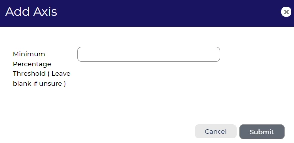
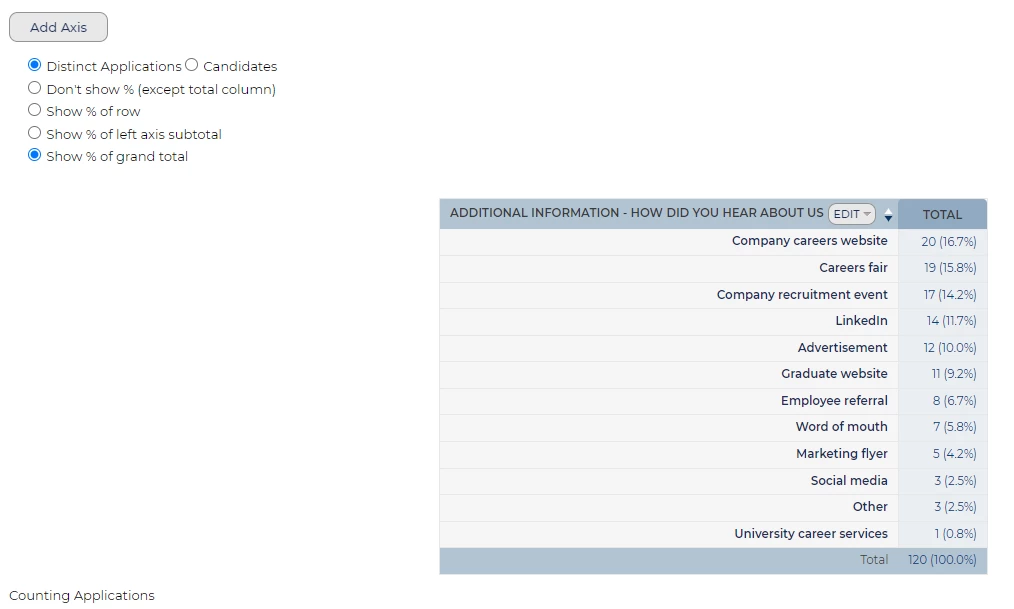
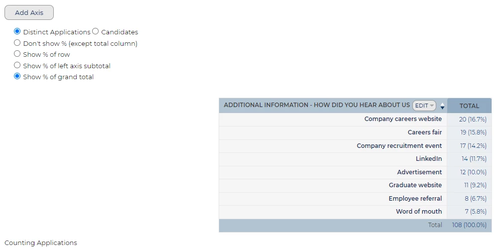
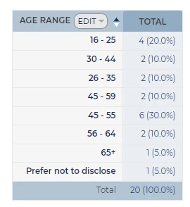
💡 You may have come across the Minimum Percentage Threshold field when editing an axis on your report and noticed the note, “Leave blank if unsure.” This section is often overlooked, but it can be a powerful tool to refine your reports and make them more meaningful.
By setting a Minimum Percentage Threshold, you control how much data appears based on the grand total of your population. This ensures your report shows only the most relevant information, cutting out noise from infrequent occurrences and helping you focus on what really matters.
🔧 Use Case: Let’s say you’re reporting on Application Source, a field that might have dozens of options. Without a threshold, your pivot table could end up cluttered with rarely used sources. Applying a threshold, such as 5%, means you only display sources that contribute at least 5% of the total applications - giving you a clearer view of the top contributors without the distractions of less significant data points.
📌 Pro Tip: We recommend initially adding your axis without a threshold, so you can review the full data set and decide on a meaningful percentage to apply later.
How to Apply the Minimum Percentage Threshold
Once you have added an axis to your report, you’ll have the option to set the Minimum Percentage Threshold via the Edit option. To help with your decision, enable the "Show % of grand total" option - this will display percentages alongside each data point, allowing you to choose the right threshold for your report based on actual figures.
Grouping Dates: Organising Data for Clearer Trends
💡 When analysing data, grouping dates by year, quarter, or month can be a powerful way to identify patterns and trends over time. While this feature might seem like a simple way to tidy up your reports, it actually helps you focus on the bigger picture, revealing insights that individual data points might hide.
Grouping by year, quarter, or month simplifies the data and makes it easier to spot trends, whether it’s seasonal shifts, growth spurts, or areas of decline. This method allows you to compare performance over set periods, making your reports more actionable and insightful.
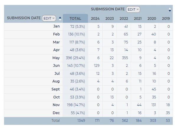
🔧 Use Case: Imagine you're analysing submission volumes across the year. Without grouping, each submission date would appear individually, cluttering your report with unnecessary detail. However, grouping by month, quarter, or year turns this overwhelming data into a trend analysis. Instead of focusing on daily fluctuations, you’ll be able to see larger patterns - highlighting peak periods of activity or times that might require extra focus.
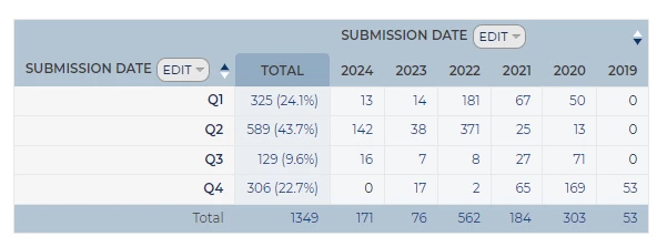
📌 Pro Tip: Always consider what story you're trying to tell with your data. Grouping by date gives you a high-level view, perfect for spotting trends over time. Start by grouping dates into months for short-term patterns, then expand to quarters or years for a broader view of long-term trends.
Mastering Status Group Sets for Clearer Reporting
💡 Recruitment involves many stages, and Oleeo’s Status Group Sets help you organise and report on where your candidates are in the process. Instead of dealing with dozens of granular statuses, you can bundle them into broader categories, making it easier to track overall progress.
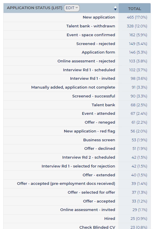
🔧 Use Case: Status group sets are ideal for reporting on candidate pipelines. For example, you can group statuses like "Application Submitted," "Under Review," and "Assessment Stage" to see where the majority of your candidates are. This helps pinpoint bottlenecks in the hiring process or assess how quickly candidates move through each stage. Remember, it’s all about telling the story of your recruitment funnel!
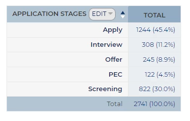
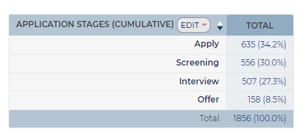
Unlock the Power of Cumulative Reporting with Status Group Sets
💡 Once you’ve added an axis in your report, an additional option appears to make the data cumulative. This option lets you show the running total of candidates, providing even greater insight into trends over time.
By presenting Status Group Sets and their cumulative option in one flow, you provide a full picture of how they work together, empowering your users to better track and report on candidate journeys. This grouping method is particularly useful for identifying bottlenecks, seeing where candidates drop off and pinpointing stages where most candidates are clustered - ultimately giving you a clearer view of process efficiency.
🔧 Use Case: Imagine you’re analysing recruitment for several roles across your organisation. Without grouping by status, your report might show an overwhelming list of individual candidate statuses at various stages, making it difficult to draw conclusions. By grouping candidates by key stages in the funnel - like “Screening,” “In Progress,” and “Final Decision” - you can instantly spot which stages have the most activity and which are slowing down, giving you actionable insights to streamline the process.
📌 Pro Tip: Start by defining key stages in your recruitment funnel, then group candidates into these cumulative statuses to get a clearer view of overall progress.
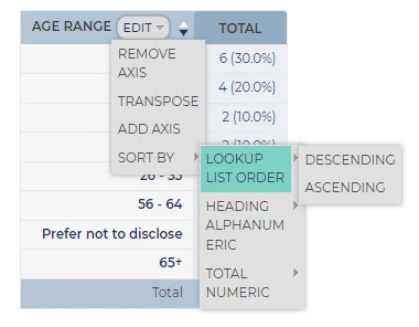
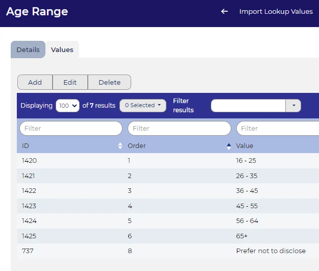
Sort Your Reports by Lookup List Order for Greater Clarity
💡 When working with reports, you may often need to sort data based on a specific order from a lookup list. Previously, sorting could be limited to alphabetical, numerical or date order, but now you can sort your report by the exact sequence of the original lookup list. This improvement enhances the clarity and relevance of your reports, ensuring that the information is presented in the order that makes the most sense for your analysis.
Sorting by Lookup List Order helps maintain consistency, particularly when the order of categories or priorities is crucial to understanding your data. This is especially useful in scenarios where the natural order of items (such as stages in a process or levels of priority) follows a strategic sequence rather than alphabetical order.
| 
|
📌 Pro Tip: Always ensure your lookup list is correctly defined and follows the desired order before applying this feature, as the report will mirror the sequence set in the list.
Sorting Your Data to Uncover Trends
💡 Oleeo allows you to report data in ascending or descending order, which can help highlight key insights. For example, if you’re reporting on application volume, you could create two reports - one sorted in ascending order and the other in descending order. This gives you a quick view of both top performers and areas that need attention.
Simply select Edit on the axis you wish to sort, then choose Sort By > Total Numeric, and select either Descending or Ascending.
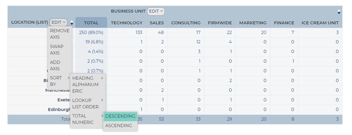
🔧 Use Case: If you’re analysing candidate applications across different departments, you can create one report showing the top 10 departments with the highest number of applicants and another highlighting the lowest 10. This approach makes it easy to identify where your recruitment efforts are thriving and where they may need more focus.
Save Time by Copying and Tweaking Reports
💡 Do you need to run similar reports but with small tweaks? Instead of starting from scratch, you can simply copy an existing report and make quick adjustments. This feature is particularly handy for creating multiple versions of a report based on slightly different criteria.
Edit the report you want to create a new version of, select 'Save As', and provide a new title. You can then make the necessary changes to the new report.
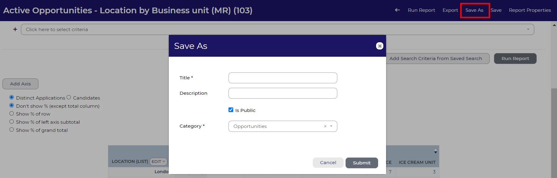
🔧 Use Case: If you’re reporting on candidate progress by region, you can create one report for the North region, then copy it and tweak the criteria to generate a similar report for the South region - saving you time and effort.
Control Report Access: Public vs Private
💡 Oleeo gives you the option to make your reports public or keep them private. A private report is great for personal use or when you’re refining the data before sharing it with the team. Public reports are perfect for sharing insights with others in your organisation, especially when collaborative input is needed or when reporting to leadership.
To change user access for a report, navigate to 'Report Properties' on the right-hand side of the dark blue ribbon menu. From there, select the 'User Access' tab, where you can update the access settings.
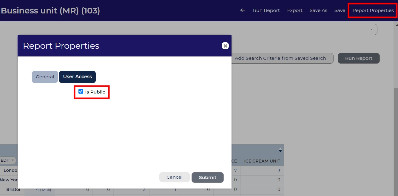
Important: If you plan to include your pivot table in a Report Hub report and want to share it with others, make sure the pivot table is set to 'Is Public'.
🔧 Use Case: You might start with a private report while experimenting with different layouts or data sets, and once you're confident in its usefulness, make it public to share your findings with the wider team.
😊 Tell us your wins! We’d love to hear your top tips when creating your pivot tables. Have you created any particularly useful reports that you would like to share?
BENEFITS
- Tell a Clear Story: These tools help you filter, group, and present your data in a way that communicates the story you want to tell - whether it’s candidate progress, diversity hiring, or departmental performance.
- Save Time: Features like report copying and rollup lists streamline your reporting process, helping you work efficiently.
- Collaborate Effectively: Sharing public reports allows your team to stay aligned and make data-driven decisions together.
- Enhanced Data Clarity: Sorting by lookup list order and grouping dates helps present data in a more structured and understandable format, highlighting key insights.
- Informed Decision-Making: The ability to use minimum percentage thresholds and cumulative reporting helps in making informed decisions by focusing on significant data and trends.
CONSIDERATIONS
- Data Capture: Ensure that the necessary data points are captured within the system before attempting to generate reports. Verify that all relevant items are included in the data dictionary and remember that reporting on free text items is not possible.
- Data Sensitivity: When making reports public, consider whether the data should be accessible to everyone or kept confidential.
- Regular Review: Ensure that the criteria and categories in rollup lists and status group sets remain relevant to your reporting needs.
- Data Accuracy: Ensure that your lookup lists and thresholds are accurately defined and updated to reflect current data and reporting needs.
- Consistency in Reporting: Be mindful of maintaining consistency in how data is grouped and reported to avoid confusion and ensure reliable comparisons over time.
- User Training: Ensure that team members are trained to use these features effectively to avoid misinterpretations or errors in reporting.
- Performance Impact: Large or complex reports with extensive sorting and grouping may impact system performance; ensure reports are optimised to avoid slowdowns.
COSTS
This feature is part of the standard product offering.
NEXT STEPS
For personalised advice, reach out to your Oleeo Customer Success Manager. Or, why not take it a step further and sign up for our Reporting Masterclass to sharpen your skills?
ADDITIONAL INFORMATION
Search for Rollup Reporting or Status Groups in the configuration guide for more information on how to set these up in your system
Check out this article for more information on creating a time in stage report:
Read our Tip Tuesday on Rollup Lists:
Watch our webinar on statistics reporting:


